Due at 12pm on 10/09
Intro / Instructions for A4 can be found here. Please work through all sections under Lesson 3.
Part A / Part A is to simply complete Lesson 3 as mentioned above.
Part B / This part of the assignment is not related to cartography whatsoever. In fact, it’s a graphic design task. Your task is to find three quotes that are meaningful to you. These could be in the form of things that renowned individuals have said, or a passage from a book that you love, etc. Once you have your three quotes, you will create simple “poster” for each. Here is a tutorial to guide you along. However, the tutorial is simply a didactic tool, meant to help you navigate in Inkscape. I encourage you all to go the extra mile when possible. When you foster a real interest in what you’re doing, suddenly the work doesn’t feel so much like work after all does it? I want you to use this little task as an opportunity to practice some of the principles we’ve been learning in class. This means practice creating depth and contrast; visual hierarchies; and generally just exploring expression via typography–and to a larger extent–design.
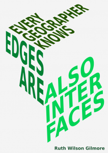
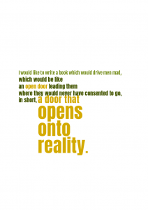
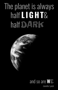
Nice examples from the 2017 cohort:
So here here are the criteria that you must follow for your typography posters
- You must use typefaces that work together. You can research these online if you wish, but I linked to a number of reference sites in the slides for lecture 3 (which you can download via the Schedule page).
- At least one of your posters should utilize typefaces from GoogleFonts. As I mentioned in lecture 3, GoogleFonts is a wonderful repository of free, and often beautiful, typefaces for the web and beyond.
- Two of the three posters must be in color. It is up to you to decide how and where to deploy the color. But I want you to begin practicing/thinking about this ahead of lecture 4, which will be all about color. The remaining poster must be simply black and white. The idea here is to force you to focus on the typography and how you’re conveying the sentiment of the quotation through your typographic choices.
Deliverables /
- Your final emergency response map for the Borough of Bellefonte, PA. I want to see that each of you revised your maps based on feedback you received during the critique from last class.
- Three typography posters visualizing select quotes of your choice.
Please save your maps and your posters as image files (PNG, JPG, etc.). Additionally, please come to class prepared to speak intelligently about your maps and your posters.
Also remember to use this naming convention (Lastname_firstname_A#) when you upload the assignment to your student folder on the Google Drive.
And finally, if you have questions or run into problems with the assignment, please post those to the class Help forum.

