due at 12pm on 11.20
Intro / The phenomena of homelessness persists as part of the American social landscape. Perhaps unsurprisingly, New York City sits atop every list of American cities and their respective homeless populations, followed of course by the famous Skid-Row harboring Los Angeles. However, the gap between these two cities and their homeless populations is truly more of a chasm. An article on Forbes.com (using data from the U.S. Dept. of Housing and Urban Development) reported 73,523 people in New York City who experienced chronic homelessness in 2016. Los Angeles reported some 43,853 for that same year. Given that NYC’s population is nearly twice that of LA, this disparity almost makes sense. But really the question of why homelessness remains such a persistent problem in New York (and elsewhere across the country) is much more vexing.
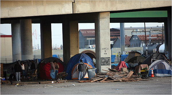
Homelessness is a phenomenon whose inner mechanisms are poorly understood. Researchers believe that lack of affordable housing is a primary contributing factor but that belief is backed by a relative paucity of meaningful data. New York City in fact collects very little data on its homeless population. This is especially true for those individuals who exist outside of the municipal shelter system, which is far more commonplace than you might imagine. Shelters are notoriously unsanitary, underfunded, and are hotbeds for violence and communicable disease. So it’s not surprising that many people prefer to simply sleep on the street, or build semi-permanent dwellings/structures/camps in the few uninhabited parts of the city that still exist. However, the very public presence of homeless people on the street is one that the city neither endorses or condones, and there have been a number of initiatives (as well as untold amounts of money spent) to ‘clean up the streets’ so to speak. This gets at one of the interesting debates going on amongst New Yorkers these days–mostly city officials–about whether or not the homeless population is growing or shrinking. If you follow the news at all, you will likely hear various talking heads saying that it’s definitely shrinking, while others reply in diametric opposition. So given the aforementioned paucity of data, how do budding GISers such as ourselves go about exploring this phenomenon?
Part I / Today you are tasked with creating an exploratory map that either supports or denies the belief that homelessness is on the rise in NYC. You will do this by mapping 311 service request calls for complaints of ‘Homeless Encampments’ over a 7 year period, 2011-2017. However, to begin, a few caveats are in order. This variable (311 service requests) is in no way a complete portrait (or even an accurate one for that matter) of the phenomenon of homelessness. It does not describe the city! It describes only the complaints people file. And in this case, those complaints are of homeless encampments. So, this says nothing of who is living in these encampments (men, women, children, black, white, or purple). Only that someone allegedly saw one and reported it. Now, all that said, mapping these service requests can still provide some meaningful insights into the issue. Presumably a higher incidence of these reports in certain areas is due not to a higher rate of cell-phone ownership amongst that area’s residents (although maybe?); we assume that more complaints = more encampments. But we could assume that more complaints = whinier people…jk!
The challenging part of this assignment will lie in how you choose to represent your data, which will be entirely up to you. When you download the 311 service requests from NYC Open Data, clean it, and import it into Arc (or Q) you will be working with points. So you could aggregate those points to some administrative unit (PUMAs say) and show the percent difference for each PUMA per year, then make your inferences from there. Or, you could make dot density maps for each year, which would be a more visual, less quantitative way of exploring the data. Or, you could adopt some entirely different approach to visualization. Whatever works, works. However, a word of caution here, choose your method of visualization with care as I will ask you to step through the logic behind your symbolization choices in the accompanying write-up portion of your layout.
Part II / This is simply the written portion of the assignment, which should be featured on your layouts. See the deliverables section below for further information on what to include. These write-ups should be well-written, using complete sentences and proper grammar. Furthermore, if you’ve done your research, your write-up should be interesting, informed, and make a reasonable case supporting your stance on the topic of homelessness in NYC.
Data /
- 311 Service Requests from 2010 to Present, homeless encampments – NYC Open Data, NYC311
- DHS Daily Report (2018) – NYC Open Data, NYC Department of Homeless Services (optional, use if you wish)
- NYC Geodatabase (2018), NYC boundaries and features – CUNY Baruch College, Newman Library
To Begin /
- Navigate to the NYC Open Data website
- In the search bar type ‘311’ and click the top hit (311 service requests 2010 to present)
- You should have been taken to a new page, click the blue ‘Explore Data’ button to access a dropdown menu > ‘View Data’
- Now you should be looking at a spreadsheet for ALL 311 service requests since 2010. You’ll need to create a filter for ‘Homeless Encampment’ complaints.
- Click the blue ‘Filter’ button and create two filters on this dataset
- ‘Complaint type’ is ‘Homeless Encampment’ > hit enter and you should see the data update to the filtered view
- ‘Create Date’ is between ’01/01/2011 12:00:00 AM’ and ’12/31/2017 12:00:00 AM’ > hit enter again, and again your data should update to reflect your filters
- Click the light blue ‘Export’ button and download as ‘CSV for Excel’
- Open the CSV file in Excel and prep it for analysis
- remove any extraneous columns (up to you, I only kept: Unique_key, Created_date, Location_type, Zip, Community, Borough, Lat, Long)
- remove any records that are missing lat/long coordinates (you could do this by sorting the Lat column > Ascending, then any blanks will be at the bottom, simply select and delete)
- highlight both the lat and long columns > Format > choose Number with 8 decimal places
- Now you need to break the data up by year
- insert 3 blank columns next to Created_date
- Select the Created_date column > Data > Text to Columns, this should open up a dialogue box
- Choose Delimited > then Space as the delimiter > Next > Finish
- Now the timestamp part of the Created_date column should have been moved over to two of the three empty columns you created, go ahead and delete those columns now, we only want the date
- Select the Created_date column > Format cells> choose Date > MM/DD/YY format (e.g. 12/22/16)
- With the Created_date column still selected > Filter > click the box for only 2011
- Now simply select all and copy to a new spreadsheet > Save as a CSV file with some intuitive naming convention (I used: 311HE_YEAR, e.g. 311HE_2011)
- Repeat this process for each year additional year, you should end up with a total of 7 CSV files (2011, 2012, 2013, 2014, 2015, 2016, 2017)
- Open ArcMap (or Q, but instructions are for Arc) and start a blank document
- Add all of your CSV files of 311 Service Requests for Homeless Encampments to the TOC
- For each CSV, right click > Display XY values > accept the defaults and say ok
- Once you’ve done that for each CSV you should see 14 data layers, 7 CSVs and 7 temporary ‘Event’ point layers
- Now right click the Data Frame > Properties > Coordinate System > Choose WGS1984
- Working one by one, right click each of your temporary point layers > Export data > Click radio button for ‘use same coordinate system as data frame’ > Save in your working folder with the same intuitive naming convention (I used: 311HE_YEAR_points)
- Say yes when asked if you want to add the layers to your TOC
- Before moving forward, go ahead and remove the temporary event point layers and the CSVs
- Now right click the Data Frame again > Properties > Coordinate System > Choose ‘NAD83 State Plane New York Long Island (feet)’
- You have now successfully added spatial references for your point data, and reprojected it to the correct coordinate system
- Save your project before continuing
- Now you can add whatever boundary/feature/representation layers you wish
- You’ll need to aggregate the point layers to some administrative unit (I used PUMAs, but it’s up to you) via Spatial Join (Note: you’ll lose some points when you join by spatial location because not all points fall easily into the administrative unit polygons. There are ways to mitigate this–i.e. you could use the geoprocessing tool ‘Spatial Join’ and set the join parameters accordingly–again, up to you)
Okay, this is where the instructions end. You should be familiar enough with GIS programs to handle the rest on your own. However, see below for some tips.
Tips & Tricks /
- If you’re feeling overwhelmed by this assignment, go here (for Arc-specific instructions) or here (for Q-specific instructions) to see a very similar tutorial that will step through these processes in a much more in-depth manner
- The DHS Daily Report dataset is entirely optional. It is essentially just a daily census of the city’s municipal shelter system. Obviously you can’t map this data as it is, but you could summarize it by year and create a bar graph (or some other visual) to include in your layout/analysis. Given the limitations of using 311 service requests, this could help paint a more accurate portrait of the city’s homeless population for those of you who want to get into the nitty-gritty. If you want to use this dataset, here are two blog posts (p1, p2) that provide a decent summary of how to process and use it
- Once you map all your points, if you see that most of the action is in one borough, you could simply restrict your analysis to that borough…just a thought
- Some of you might be interested in mapping the Location_type column of your homeless encampment point data. This column details where (park/playground, street, residential building, etc.) the encampment was located. This would be a qualitative map (use a qualitative color ramp) and could potentially serve as a nice supplemental map, depending on your angle of course…again, just a thought.
Deliverables /
- 1 map (or series of maps, as many or few as you need to tell the story) exploring the spatial distribution of 311 service requests for complaints of homeless encampments in New York City for the years 2011-2017, following standard cartographic conventions (north arrow, scale bar, legend, etc.)
- 1 write up (included in the layout) that addresses the following:
- paints a general portrait of the current state of homelessness in NYC
- states whether you believe, based on your exploratory analysis, that the homeless population in NYC is growing or shrinking
- provides ancillary information, details, facts, statistics in support of your stance on the issue (basically, what is the logic behind your opinion)
- steps through the logic behind your visualization choice, why it’s appropriate etc.
- states any limitations of the datasets you’re working with (I pointed out at least one for you in the intro section)
- Proper citations for data/journalistic sources
Constraints /
- This assignment requires that you do a bit of research prior to beginning. This not only ensures that you have some understanding of the phenomenon, but it is essential to forming any kind of intelligent opinion on the matter. So, you are required to cite a minimum of three sources in your write-up. Two of these must be journalistic articles (e.g. from the NYtimes, NYmag, or other newspapers/magazines).
- You must use one additional dataset to the ones I have provided for you. For example, are the 311 service request points spatially concentrated in areas where you know there are many subway entrances? If so consider adding a point layer of subway entrances to your map/visualization to further illustrate your point. Check the NYC geodatabase from Baruch Newman Library…there are many NYC features included therein.
Save your layouts as medium-res (150dpi or +) image files (PNG, JPG) with the naming convention LastName_FirstName_A8 and upload to your Student folder by the deadline.

This entry is licensed under a Creative Commons Attribution-NonCommercial-ShareAlike 4.0 International license.

